News from AI & Analytics at Wharton
Wharton AI & Analytics Accelerator Helps RxSense Tackle AI Challenges in Healthcare

Rick Bates, WG’96, CEO of RxSense, joined the Wharton AI & Analytics Accelerator to explore new solutions to two high-priority challenges: automating long-range drug pricing forecasts and reverse-engineering pharmacy benefit plans. Through the 8-week collaboration, RxSense gained fresh modeling approaches, actionable AI frameworks, and a clearer path to full automation—outcomes that are now directly shaping ...Read More
Wharton AI & Analytics Initiative Launches the Wharton Causal Data Science Lab, Led by Professor Dylan Small

The Wharton AI & Analytics Initiative introduces the Wharton Causal Data Science Lab (WCDSL), a new research lab dedicated to advancing the science of causal inference and its application to real-world business and policy challenges. Read More
Fighting Dyslexia, Breaking Chatbots: Inside the Winning Projects of Wharton’s 2025 Hack-AI-thon
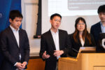
The second annual Wharton Hack-AI-thon challenged Penn students to push the boundaries of artificial intelligence — and they delivered. From helping educators support students with dyslexia to convincing a medieval knight made of cardboard to spill company secrets, this year’s winning teams took wildly different paths to AI excellence. Read More
Stay Updated
Knowledge at Wharton
Research and Insights
Markets Brace for Tariffs and Look to AI for Relief

Jeremy Siegel examines how investors are responding to geopolitical uncertainty, looming tariffs, and the promise of AI-driven productivity.Read More
How AI Is Reshaping Customer Experience and Expectations

Wharton professor of operations, information and decisions explores how artificial intelligence is transforming customer service operations.Read More
Does AI Limit Our Creativity?

New research from Wharton shows that AI users tend to generate similar ideas, which can hinder innovation. Read More
The AI Efficiency Trap: When Productivity Tools Create Perpetual Pressure

AI is boosting productivity, but that doesn’t guarantee better working conditions for humans, writes Wharton visiting scholar Cornelia Walther.Read More


